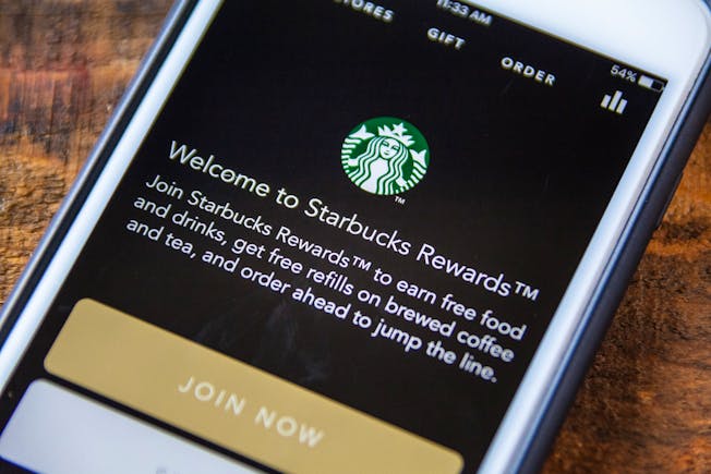
This week's top six infographics

Here's a round up of some of the best infographics we've seen this week. 

We have infographics on Facebook's IPO, bounce rates, keeping users engaged with your emails, tag management, and some great mobile stats.

If you can't quite read the text, click on the images to see a larger version...

The Potential Of Facebook’s Newsfeed Ads vs. IPO valuation (Webtrends)

Why do users become disengaged with your email? (Litmus)

The ultimate mobile web infographic (Bootstrapper's Guide)

Bounce rate demystified (KISSmetrics)

This is actually an old one, but a) I haven't seen it before and b) it's good... 

Facebook vs Google Display Network (Wordstream)

The ROI of tag management (Tealium)

(From Econsultancy's The ROI of Tag Management report.)

Graham Charlton is Editor at Econsultancy. Follow him on Twitter or connect via Linkedin or Google+

Add your own

Reader comments (3)

  1. Tim Lennon Tim Lennon

    Consultant at Independent

    10:27AM on 18th May 2012

    5.5bn 'mobile subscriptions'. What on earth does that mean?

  2. Avatar-blank-50x50 Steve Henderson

    11:31AM on 18th May 2012

    I am sorry, but there are so many errors on here; where to start.
    Too many infographics are simply produced for the sake of it, by people who know how to Make Pretty Things; but who don't understand what the numbers mean; so they end up Making Pretty Things which misrepresent the numbers and coming up with unjustified, unsupported conclusions.

  3. Avatar-blank-50x50 Ketan Samani

    12:59AM on 22nd May 2012

    Thanks to infographics, communicating complex subjects is made easy in less time.. Very cool.

Log in to post a comment