 In the competitive world of online car insurance Aviva and More Than offer the best overall user experience, according to a new report
Overall insurers tended to achieve the strongest scores at the ‘buy’ stage, with an average score of 81% compared to 59% at the ‘choose’ stage.

Find
RAC achieved the top score (76%) in this section, which assesses the layout of the sites, login and search functions, the home pages, the navigation, clear call to actions (CTAs) and any visible promotions offered.
Admiral achieved just 53% in this section owing to its poor use of breadcrumbs and cluttered layout.
Customers in the online car insurance industry vary massively as some are familiar with the process while others are entirely new to the experience, so retailers need to ensure the navigation process is easy to understand.
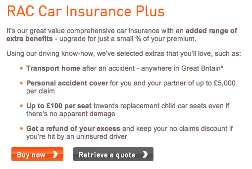
RAC and Aviva achieved high scores for signposting special offers and promotions as it increases customer engagement.

Aviva’s yellow CTA is perhaps less prominent as it blends into the overall theme, while RAC’s CTAs stand out against the white background.
The report also evaluated the on-site search functions of each retailer. Nationwide, Sainsbury’s Bank, Barclays Car Insurance, More Than and RAC all offered an intuitive search function, correcting mistakes, and in some cases, such as that of RAC and Aviva, offering an advanced search function.
Positioning of the search function is important for the user experience, as it needs to be easy to spot. More Than and Nationwide have designed excellent search tools, while Co-op’s is hidden among a cluttered header.
More Than’s search tool

Nationwide’s search tool

Co-op’s search tool

Choose
More Than came top in this section with a score of (76%), while Swiftcover achieved just 42%. Sites were analysed based on search results, information given to aid the customer decision and the ability to apply filters.
A typically high performing site would:
- Offer the user filter options on the search results.
- Return relevant and comprehensive results.
- Present the results in a clear and understandable fashion.
- Give the visitor all the appropriate information for the type of item they searched for.
- Offer user reviews.
- Have a prominent call-to-action.
Additionally, a high-performing website would personalise its offering for different behavioural segments based on such criteria as price sensitivity or specific search terms.
All the websites analysed in this benchmark ensured that product details were easy to find, many using a tick-box style to create simplicity and ease of understanding for their visitor.
Aviva opted for a key instead of tick boxes, resulting in a slightly confusing and complicated experience for potential customers.
Nationwide’s features list

Aviva’s features list

Designing an effective product page for car insurance is quite tricky as it doesn’t lend itself to strong visuals.
Instead it’s important for car insurance retailers to offer a simple yet detailed product description for their website visitors, so that they can easily understand what they are purchasing.
Overall most sites got the balance between text and imagery about right, although Co-op and Admiral both suffered from having too much or oversized text. This impacts the user experience as pages appear cluttered and it’s difficult to spot the CTA.

Buy
This section analyses the checkout process, including the clarity of the price, ease of registration and quality of information displayed.
More Than came top with 85%, closely followed by Nationwide and Swiftcover at 83%. This was the highest scoring of all the benchmark sections, with the average being 81% while the lowest score at 74%.
All the websites quarantined their checkouts which means the user’s attention isn’t distracted by other options and most offered user shortcuts such as a postcode lookup tool.
Also, though most websites only checked the form for errors on submission, More Than and Swiftcover proved superior in this area by checking the form as the information was given.
Overall, each of the insurers has designed a user-friendly checkout free from unnecessary stages. And with the exception of RAC, the sites all displayed a progress bar so users know exactly where they are in the buying process.

Comments