 You’re probably growing tired of the phrase
THE THEORY
1. Multi-device layout patterns
The sagely Luke Wrobleski presents various different approaches to page layout. Well worth a read if responsive design is a new concept to you, or if you are about to embark on your first responsive project.
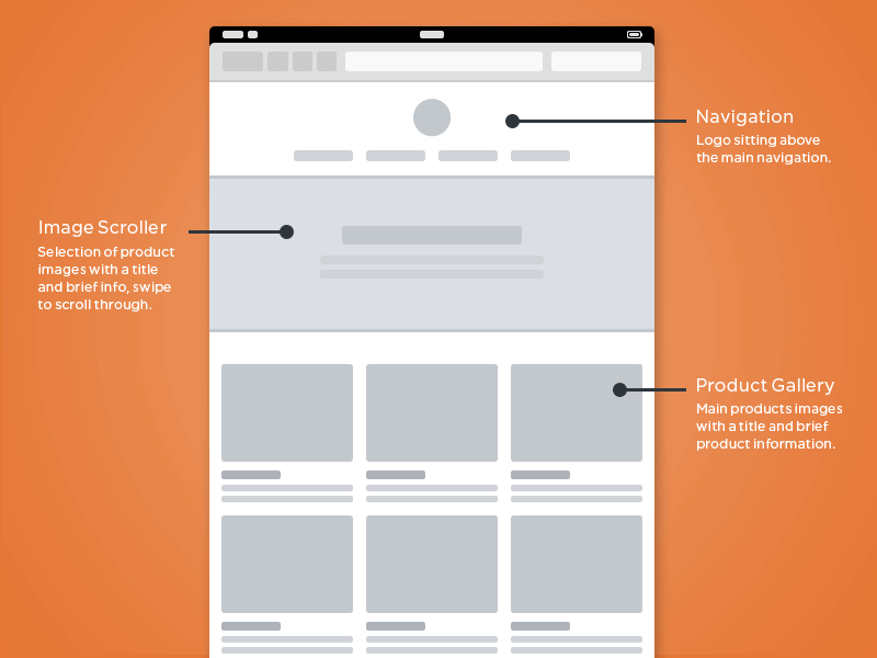
2. Wireframing for responsive design
Leigh Howells at Boagworld offers up a great primer on responsive design, and concludes that:
On a mobile page there are really only two hot areas, the header and the footer, both of which will need to carry important navigation options for our site. Everything in between is fairly equally weighted.
3. Complex navigation patters for responsive design
Do you really think that those mega-dropdowns are going to work on a mobile device? Here are a bunch of approaches to responsive navigation design for different screen sizes.
4. Responsive is a characteristic
In which Stephanie Rieger suggests that “mobile is an opportunity to reboot”, something I heartily agree with.
Developing a standalone (but responsive site) provides an ideal opportunity for learning and experimentation. It enables you to re-focus your content, lighten and streamline your experience, and deliver real user value—without the (often all too real) burden of re-structuring your entire legacy web site.
5. Responsive retrofitting
This is “about finding a way to use responsive techniques on legacy sites to create a better experience for more users”. Ben Callahan explains that you don’t need to start over, and shows you that a little CSS can go a long way.
THE TOOLS
6. Wirefy
This is a responsive wireframing framework that allows you to play around with page layouts within the browser.

7. Rubber Cheese
A wireframing template from Rubber Cheese, which caters for three different screen sizes: 978px, 768px and 320px. This is a free vector file, for Adobe Illustrator fans.

8. UXPin
A collaborative online design tool, which costs from $12 a month. Looks promising for remote / distributed teams.

9. Chris Bannister’s templates for Photoshop
Provides templates for desktop, tablet and mobile screens.

10. Gridset
Mark Boulton’s app allows you to create complex grids with breakpoints to adapt your layout for various screens. Costs $18 / £12 a month.

11. Jetstrap
I’m very keen to try out this web-based responsive wireframing tool for Twitter Bootstrap (which I’d also like to play around with). One project / three screens is free, otherwise it’s priced from $8 a month.

12. This Man’s Life’s content repositioning tool
This interactive tool allows you to flip between desktop and mobile views, to see how content elements will be repositioned according to screen size. Aim for the top right of the page to switch things up.

13. RWD Wireframes
Here’s another online tool for figuring out how to position your content on various devices.
OLD SCHOOL
14. The Responsive Design Sketchbook
Here’s a notepad specifically created with responsive designers in mind. I love this kind of thing. Here’s what the pages look like…

15. Printable
Take a look at these wonderful download-and-print wireframing grid templates. Various sizes, all of which are fantastic for those of you who like to sketch…

INSPIRATION!
16. Media Queries
See how other sites are winning the responsive game.

TEST
17. Resize my browser
A neat tool that allows you to test your web pages to see what they look like on different screen sizes.

18. Design Modo’s test
Excellent for seeing how your web pages render on all manner of devices. Simply add your URL and then choose from dozens of devices in the top right menus.

Hope that helps. Do let me know if I’ve missed anything obvious, and by all means share your responsive design tips in the comments below.
Comments