
Search
Ikea’s Billy bookcase range is the company’s most popular product, it sells one every 10 seconds.
Let’s take a look at the search results for ‘bookcase’.
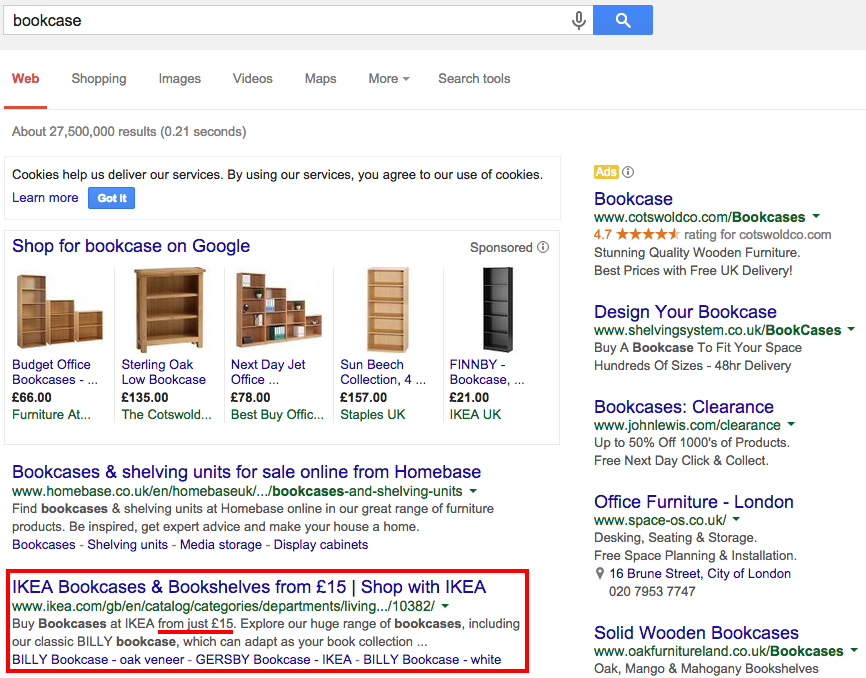
Ikea isn’t currently running a PPC campaign for this, possibly because it feels it doesn’t need to as they’re popular enough, or perhaps as it’s January this might not be the right time of year.
However as Ikea’s listing is below one from home furnishing rival Homebase, perhaps a paid search listing for ‘bookcase’ would position the brand higher within the ad area.
The Ikea listing’s blue link and rich snippet are already optimised well with an attractive and clear price point.
Interestingly Ikea uses Google Shopping (more information on how to use Google Shopping here) and this listing for its Finnby bookcase appears as the fifth ad in the row.

The listing manages to stand out purely because it’s a different coloured product from the rest, and carries a much cheaper price tag.
Let’s try some more popular items, starting with ‘picture frames’.
Although there is no paid search ad or Google shopping listing, Ikea does have the top result in the organic listings.

However with the sheer number of paid-for listings here, I wonder if its organic result is a little lost. Again it may be worth running a PPC ad just to mix things up a bit.
Here are the results for ‘sofa’.

A Klippan is as ubiquitous as a Malm in homes worldwide, yet here the Ikea listing for ‘sofa’ doesn’t appear until the seventh organic listing. More so than the other search terms, Ikea could certainly benefit from a paid search presence here.
Landing page
Let’s take the Google Shopping listing as our control product.
Upon clicking the link, the target is exactly what it should be, the relevant product page.

Although the main image doesn’t have options to show the product from other angles as other products here do, there is the ability to click and zoom into any area your mouse hovers over.
There are also colour options, further complementary products and a simple drop down menu that allows you to check availability in your local store for click and collect.
However, improvements could certainly be made below the fold.

The product information text is tiny and the section on the right suggesting alternative products contains images so minuscule they may as well not even be there.
On the plus side though, and most importantly for speed and clarity, the price is clear and the add-to-basket button bright and obvious.
It’s just a shame there’s no information regarding delivery options, charges or returns policy. In fact when you click on the Home Delivery Service link, it brings up a text box, which still doesn’t contain anything useful and the ‘x’ to close the box obscures some of the text.

Once adding the item to the cart, the pop-up box featuring a variety of font sizes and misaligned text doesn’t inspire the most amount of confidence.
Cart
Although there’s a good use of white space here and lack of distractions, the text and thumbnail images again feel inaccessibly small. It seems strange as the blue CTA seems conversely huge and obvious.

Unfortunately as it’s a non-responsive site, shrinking down the browser does nothing to affect it.
To be positive, any cart information you may require is all here, with options to update quantities, delete the item, continue shopping or move the item back to a shopping list.
Here is also where you can check the delivery costs. Unfortunately the thorny issue of having to put a space in your postcode is present, and as pointless as ever.

Once I’ve entered my postcode correctly, the total cost is updated with the delivery price.
Although there are no options for faster or nominated day delivery, and frankly the £39 delivery charge seems inordinately steep. If there was a threshold for free or cheaper delivery available then you might possibly buy more than just a bookcase.

Checkout
Thankfully there is an option for guest checkout once you’ve moved on from the cart, which should speed matters up.
Once a customer is ready to buy, they don’t want to have to fill out pages and pages of personal details and create an account before they can make a purchase.

About the best thing I can say about the first page (of four) in the checkout is it has remembered the postcode I entered earlier.

Unfortunately this is one of the starkest, clinical and fiddily web-forms I’ve seen for a while.
It also automatically opts you in for email marketing and if you want to opt out you have to click through to a different page where you have to enter your email address again.
This is a poor customer experience, which presents a number of barriers (including the tiny text boxes and lack of autofill) before even getting to delivery or payment.
The Delivery Information page is equally as cold and unhelpful at presenting information as the rest of the journey.
Although I can nominate a day for delivery (information not available before this point) it looks like I will have to stay in for 12 hours waiting for the delivery.

Finally when it comes to payment, there are no faster payment options.

Retargeting
One final positive note, two hours later after leaving the site, I received this email informing me of my abandoned cart.
The subject line itself informs me exactly what to expect from opening the email, it’s not too pushy but certainly has a sales focus.

Perhaps the first cart abandonment email sent soon after leaving a site should be more along the lines of asking if there were any technical difficulties, or if something went wrong with the purchase.
This would put the customer’s needs first and also help obtain useful feedback. Then later they can be sent a more explicit call-to-action.
The content itself is clear, with bright text, good use of space and obvious calls to action. The ‘view basket’ button is always necessary in these emails as it takes potential customers directly into the checkout process.

However on clicking the button, I’m taken to an empty basket.

Is this because I used the guest checkout? Perhaps it’s because I clicked through on the email the following day and there’s a time limit on keeping items in the cart?
Either way, if I’ve been sent a basket abandonment email, the items really should still be there, especially after only one day, otherwise it’s a complete waste of everyone’s time.
In conclusion…
In terms of search marketing, Ikea could certainly do with using a PPC campaign to boost its presence for a variety of terms, however there’s little point in doing this until it’s made significant changes to its ecommerce site.
Although Ikea has been making great strides in connecting its retail stores with digital innovation (the AR enabled catalogue for example), it feels like its checkout process is far from providing an ideal customer experience.
In fact it’s as if Ikea left the process of digital transformation at ‘building a website’ without any further thought for improving the UX through testing and feedback, otherwise it wouldn’t feel so outdated and unpleasant to use.
Last year Ikea came last in another usability test, so perhaps it’s time for the company to commit to a completely focused digital overhaul.
Comments