
Mobile product page checklist
Clear product title
There’s not an awful lot to say about this, but the title needs to be there, and it needs to be descriptive.
Price
The price is key to the purchase decision and something that users will look for instantly.
Make it stand out and differentiate with colour, size and space from the rest of the page.
Here’s a good example from Schuh:

Product images
Just because we’re dealing with a small screen, it doesn’t mean that customers will be satisfied with a single image.
If you’re expecting them to make a purchase, the images have to work to sell the product.
Here are the essential images you need:
– An individual shot of the product, showing it in its best light:

– Showing details of products helps customers to gain a better impression. For example, showing the soles of shoes so they can see the grip type:

– Showing how products work is a big help, for instance the number of input slots on TVs or, as in the case below, the amount a wallet can hold:

– Multiple images should be included too. Why not let customers scroll through a range of shots? This allows them to see products from various angles and in different contexts.

– Zoomable images. It’s also good to explain how to zoom, as John Lewis does:

Clear calls to action
Calls to action need to stand out. It should be clear to customers what steps are needed to be taken to select sizes and other options, and add items to baskets.
Some mobile CTA tips:
- Make them colourful. Test to see which colours produce the best results.
- Unambiguous wording. The wording you use should make it glaringly obvious what will happen if a user presses a button, such as ‘Add to basket’ or ‘Checkout.’
- Make them big.
- Put them where they can be seen. Buttons should be placed where users’ eyes are likely to scan as they view the product page.
- Consider adapting CTAs for different devices. CTAs should be tested to make sure they render correctly on different mobile devices, and brands should also consider the different creative options available on each device.
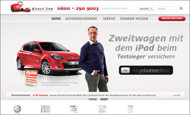
For example, Direct Line used a swipe button for the iPad-friendly version of its German homepage. It’s an action that iPhone and iPad users are very familiar with, and this led to a 9.23% increase in registrations for a quote:
Product descriptions
Generally, you’ll need two types of product description:
– A brief description near the product images which provides an overview of the product and its features. Like here on Truffle Shuffle:

– A longer description further down the product page. Here’s an example from Firebox:


Long descriptions can be an annoyance for mobile users, and they take up plenty of screen real estate. They are necessary though, especially for technical information and detail.
Size and colour selection
This should be simple to use and understand, as on House of Fraser.

Delivery information
How much things cost to deliver and when they will arrive are key questions for customers, and they should be as easy to find on mobile as on desktop.
Here, John Lewis has an expandable menu, which shows the various delivery options, charges and timescales.

Returns information
Customers need to know that items can be returned easily if they don’t turn out to be suitable.
This is true for any retailer, though perhaps more so for the fashion sector, where return rates tend to be higher.
I like the tone of Selfridges’ returns information, though it is short on detail.

House of Fraser provides more detail about how people can return items in store or by post:

Size guides
A little help ensuring customers can find the right size helps to reduce returns rates. Here Topshop links to a size chart and provides some useful advice about fit.


Add to wishlist
If customers use this feature on your desktop site, they’ll want to use it on mobile.
It helps for customers who maybe prefer to checkout on desktop, or who encounter connection issues and want to save items for later.

Reviews
User product reviews are no less essential on mobile, but sites need to be clever about placement.
The general convention seems to be to show an average review score, while placing the detail of reviews further down the page.
Here, Amazon highlights the average rating prominently, while showing the number or reviews helps users to make a quick judgement on the reliability of that score.
Schuh’s reviews contain some useful information on fit, always helpful to reduce returns rates.


Video
Video on mobile is now more prevalent, perhaps thanks to the increased availability of 4G connections, so it’s worth using on mobile if you have the content already.
Here, AO.com presents video guides to its washing machines, which is a great use of product video.

The videos play in full screen, and takes the viewers through the features of the product.
Some sites may worry about video slowing the page down, but a two minute video like this can sell the product more effectively than all the copy on the page.

Click and collect
Click and collect is becoming more popular with mobile shoppers, so it’s important to ensure that this works just as well on mobile.
The Argos app is a prime example of designing for the device, with features helpful to mobile shoppers.
It has a stock checker, and also provides useful extras for mobile users, such as directions to the store, all from within the app:

Stock checker
This is a great feature for customers on the move, allowing them to check and reserve stock from local stores.
Here, Schuh links clearly to the stock checker tool, providing various options to find the nearest store, and allowing customers to buy or reserve items for store collection.


Social sharing
There are concerns that social sharing buttons can provide a distraction for customers, but they do provide a way for sites to grab some free publicity for products.
It’s certainly something sites should test, and placement of social sharing buttons shouldn’t detract from more important calls to action.

Contact options
If users have questions, or are perhaps experiencing difficulties with a transaction, they should have a way to find help.
Links to email contact options should be provided, but a clear link to call customer services makes a lot of sense for mobile users.
Here, Schuh, provides a clear phone icon on product pages, and two clicks later, the mobile user can be calling customer services for assistance.

Cross-selling and up-selling
There’s limited space for this on mobile product pages, but retailers should still be providing cross and up-selling options.


Use urgency
Booking.com is a master at using urgency to increase conversions, and the tricks it uses on desktop transfer well to mobile.
We looked at Booking.com’s mobile site in more detail recently, but here are a couple of examples.
It shows stats to tell users how many people are viewing a particular hotel page, the subtext being that they may need to hurry before someone else books it. The same principle applies to the stats showing how many available rooms are left.


Available payment options
This can be a factor in the decision to buy, so provide the information on the options available, as Schuh does.

What do you think?
Have I missed some crucial features that retailers should be using? Are some of the ideas here unnecessary?
Let me know in the comments below…
Comments