AO.com was a joint winner with health and beauty specialist LizEarle.com, but I’m going to go with AO.com as the first place comparison here because I’m more familiar with its site and it always makes for a brilliant ecommerce case study.
I’m going to split the comparison as follows:
- Homepage
- Navigation
- Search tool
- On-site content
- Product pages
- Checkout design
Homepage
AO.com
The first thing to note about AO.com is the presence of those colourful banners that clearly display lots of useful information: free delivery, price matching, and a Trustpilot rating that instantly builds, well… trust.

The same information is displayed in a white banner beneath the navigation menu, so there’s absolutely no way you can miss it.
This is exactly the kind of stuff I’d want to know when using an ecommerce site for the first time, so top marks to AO.com there.
I was also shown this offer via a popup when I first entered the site, which was a nice touch.

The other feature I like is the large and intuitive search box on the left hand side. Again, this is the type of thing I’m going to be looking for when shopping online.
AO.com also has a normal bar at the top of the page if you just want to search by keyword, but the box on the left is particularly useful because it lets you do an ‘advanced search’ based on things like product type and fitting.

Last but by no means least, AO.com clearly displays a contact telephone number at the top of the page, complete with opening hours. I cannot tell you how much I love it when companies bother to do this.
Personally I think consumer-facing businesses should be required by law to display this information clearly on their homepage, but that’s another argument for another day.
EE
Disclaimer: I’m not here to slag off EE, as I’m sure being voted the worst ecommerce site in the country by consumers is painful enough in itself. Instead I’m going to try and provide constructive reasons as to why people might have voted in such a way.
The homepage is not overtly offensive, although it is somewhat lacking in substance.

A consumer shopping around is unlikely to care that this is the ‘biggest, fastest and most reliable network.’
True or not, that’s pure marketing fluff.
What’s much more likely is that consumers will want to know things that are immediately useful to their purchasing experience, such as delivery information or, dare I say it, something that might persuade them to become a customer.
EE has got both a ‘contact us’ and a ‘get help now button on different parts of the homepage, but in my opinion this is simply not good enough.
Just give me the damn phone number already so I don’t have to navigate the equivalent of David Bowie the Goblin King’s labyrinth just for the privilege of hearing a human voice.
Unless of course you’re actually trying to make me angry before you’ve even had a chance to speak to me.
Navigation
AO.com
The navigation menu on AO.com is extremely intuitive and I think it would easily pass the parent test, i.e. my mum and dad would be able to use it without ringing me up for advice.
The top line categories are clearly displayed, and when you hover over one of them you get a decent looking menu of subcategories complete with illustrations.

Those three boxes at the bottom of the navigation box are also a nice touch, reiterating the free delivery but also alerting customers to the £20 cashback deal and inviting them to browse the ‘BestBuy’ range.
Once you click on a particular product type you get taken to a list of results that has pretty much all the information you could want: basic specs, product image, price, colour, delivery info, financing info.
You can either add a product straight to your basket at this point or click ‘more info’ to go to the full product page.
Going back to the main navigation bar, I also like the fact AO.com includes a ‘Deals’ option on the far right hand side.

EE
EE’s menu is initially divided into much broader categories than on AO.com, i.e. ‘Shop’ and ‘Help.’ This isn’t necessarily a bad thing in itself, but ‘EE & me’ is completely meaningless out of context and doesn’t really tell me what to expect.
That aside, the navigation box that pops out isn’t bad. Everything is clearly labelled under subheadings and there’s even a list of deals on the right hand side.
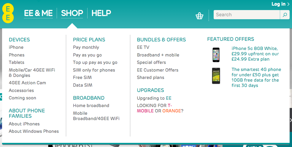
It doesn’t go as deep as AO.com in terms of subcategories, but then again that could be the nature of the respective products.
Now for my first big gripe: you would assume that ‘phones’ refers to Android devices on this menu because, though poorly labelled, it sits under ‘iPhones’ and we can use the powers of deduction we’ve been blessed with.
But when you click on ‘phones’ the first thing that comes up is a load of iPhones. And when you click on ‘iPhones’, guess what? The same.
OK, it’s not the end of the world, but in navigation terms it’s confusing and just completely pointless.
Apart from that, browsing the results is not too painful. Some basic information is displayed and you can sort products by rating/price/brand/etc.

But unlike AO.com, if we’re comparing the two from a user experience (UX) perspective, you would definitely have to click through to the product page to make a purchasing decision because there isn’t nearly enough information to do this based on the navigation page alone.
Search tool
AO.com
We know from research on supermarket UX that predictive search is something consumers want, and the first positive to note here is how brilliantly AO.com uses it on its site.
You can see in the image below what happened when I typed in ‘fridge’: not only does it display a list of suggested related items, it also lists the most popular items on the site for that search term.

Once you actually click to search, things get really interesting. At first glance it looks a little unexpected: where’s my list of products?

But on closer inspection it actually works really well by grouping the results under various product types.
Then there’s the ‘Quick Search’ feature, which lets you either see a list of all the products relating to your keyword or narrow it down further using the simple button system as I’ve done in the image below.

What’s particularly interesting about the AO.com search results page, however, is the way it keeps on reiterating all that useful information: free delivery, best price guarantee, Trustpilot rating.

Then it uses social proof in the form of popular items (complete with user reviews) and a customer quote at the bottom.
All of this stuff is making it easier for the customer to make a purchasing decision while increasing the chances that AO.com will convert a sale.
EE
The predictive search on the EE site is perfectly functional. It does everything it needs to do. But when compared to the AO.com predictive search it does seem somewhat basic.

When you put in ‘tablet’, for example, the only suggested option is the plural version of the word. Not particularly helpful.

Let’s look at the results page for ‘tablet’: 714 results in seemingly no particular order.

You can kind of sort the results using the bar on the left, but once you click on ‘shop’, for example, you are simply presented with a slightly smaller list of products with no options for further refining.

This system is fine if I know exactly what I’m looking for, but otherwise it’s not particularly helpful.
It’s also worth comparing the level of information under each of the search results compared to AO.com. Here we get nothing more than an incomplete, typo-laden, copied and pasted meta description.

Also, when I searched ‘Samsung Tablet’ and clicked on the ‘Galaxy Tab S’ result, I was taken to a screen filled with Apple tablets and Samsung accesories rather than an individual product page relating to what I clicked on. This is a major UX error as far as I’m concerned.
On-site content
AO.com
AO.com has a lifestyle blog called AO Life on its site. The blog features daily posts on anything from food to home improvement, including how-to and buying guides.

The blog page is formatted well, using short paragraphs and plenty of imagery to make it easy on the reader’s eye.

You can also pin images directly from the blog page, making it easier for people to share the content on Pinterest.

EE
EE does have a section on the site called Newsroom, although it only features press releases about the latest company updates.

In terms of on-site content that might be helpful to consumers, there is not really anything to talk about here.
Product pages
AO.com
I’m going to split the AO.com product page into two sections, the first being the initial screenshot below.

As you can see, the level of detail is ridiculous. In a very good way.
There are product images from every angle you could imagine, videos with useful information about the product, specifications, user rating, stock availability, delivery options, and a clear call to action.
But when you scroll down things get really interesting. Here you can click on one of five headings and get a much deeper level of detail about the product, including thorough customer reviews and frequently asked questions.

There’s also an Amazon-style use of social proof on the right side of the screen with ‘people who viewed this went on to buy…’, which, again, helps customers make a decision and ultimately makes a sale more likely.
EE
As you can see from the EE product page below, it provides almost no information about this product other than the price and the picture.

EE has included delivery information and stock availability, which are positive points, but there is very little here that might help someone make an informed purchasing decision.
If I wanted to know more about the product I’d have to leave the site to look it up on Google, at which point it’s quite likely I’ll find it on another site with more information and simply buy it there instead.
As for the call to action, the word ‘choose’ doesn’t exactly tell me what to expect when I click on the button. I can make an educated guess that this is the buy button, but I shouldn’t have to be guessing.

Checkout design
AO.com
When you click ‘Add to basket’ a pop-up appears with a summary of everything in your basket so far, at which point you can either continue shopping or carry on through the checkout process.

There are a few positives to note about the checkout process.
Firstly, it tells you how many stages there are and which stage you’re at so you know what to expect, while also giving you the option to sign in the make the process faster.

There is also an element of cross-selling, with additional options such as fitting or unpacking.
You can easily add or remove items, and there is a very clear ‘Checkout now’ call to action button below the total price.
Then we come to the second stage: delivery options. This section is easy to use and you can quickly get a list of all the options available to you, complete with the cost.

Again, there are some nice UX touches here, such as the delivery information displayed on the left and the total price including delivery on the bottom-right. This means no nasty surprises when you get further through the process.
Next it’s delivery information, which is straightforward enough and doesn’t bombard you with annoying questions or offers.

My favourite part about this whole process is that I haven’t been forced to create an account, which is usually the point I rage-quit a site, abandoning my basket. Perhaps that says more about me than anything, but still…
The payment sections is, again, as simple as it should be. You can either input card details, look at financing options or pay through PayPal at the click of a button.

At the bottom of the payment page there are a few more positive points to note.

Firstly the reassurance in the form of the Trusted Shops certification, but also the inclusion of a final order summary with the total price and product and delivery info.
Finally there’s an enormous (and again reassuring) final call to action button.
One last thing I want to mention about the AO.com checkout process is that, while there are four stages, they are actually all condensed into one page. This makes the whole thing feel that little bit less of a ball-ache.
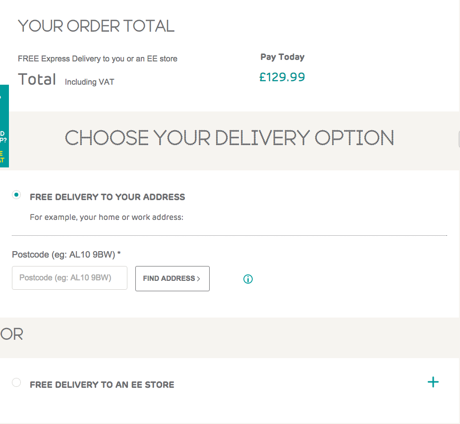
EE
There are a few initial positives to note here.

Firstly, unlike on the home page a contact telephone is clearly displayed at the top of this one in case people want to finish their order over the phone.
Secondly, there is a clear call to action button that explicitly tells you what to expect when you click on it.
EE has also included some clear direction in terms of using a voucher or finding out more information, which is good, although I’m not sure how useful the ‘important information’ actually is in terms of helping people through the checkout process.

It’s good to see the total price reiterated nice and clearly, however, along with another big call to action button.
The next stage is delivery information, and I don’t have any complaints about this part of the process. You can either input your address for home delivery or get free delivery to a local store.
Now for the part where I rage-quit. Not really, but as you can see you have to sign up as a new customer before you’re allowed to make your purchase.

Once you’ve spent ages entering all your details, you’re finally allowed to pay. Oh wait, no you’re not. First you’ll have to answer EE these questions three.

As for the final checkout page, there’s not too much to complain about here other than a lack of PayPal integration.
One thing I will say though is that the call to action button at the bottom is somewhat vague. If I click ‘continue’ will that complete the purchase or will it take me to yet another screen? I don’t know and I’m too scared to try.

In the interest of fairness, I have to say I do really like the scrolling summary box on the right hand side that follows you around. It displays all the information you’d want to know and it stays in your line of sight the whole time.

Conclusion: attention to detail wins
I wouldn’t say the EE site was particularly terrible on its own, it’s just that when you compare it to the better ecommerce sites it’s lacking in some of the finer details that make customers’ lives easier.
And unfortunately for brands that haven’t cottoned on to this fact yet, consumers absolutely expect you to make their lives easy when they’re using your site. If you ignore that fact, you’re doomed to fail. They’ll simply go elsewhere.
Look at the examples above: AO.com clearly understands the customer journey and consistently includes features and functionality on every part of its site specifically designed to help those customers find, research and purchase what they’re looking for more easily.
If it seems like too much cost or effort to help potential customers in this way, remember you’re ultimately helping them spend money on your site.
Surely that’s worth the investment?
Read more on best practice from AO.com.
Comments