
Don’t use too many buttons
Assuming that your email campaign has a specific goal, it’s advisable to focus on one or maybe two calls-to-action.
This avoids confusing the recipient and keeps their mind focused on the job in hand.
A case study from Whirlpool shows that when the brand reduced the number of CTAs in its email from four down to just one, it achieved a 42% increase in clicks.
Originally the marketing team had stuffed the emails with CTAs based on the assumption that more buttons equals more clicks.
However all four CTAs related to separate actions, which distracted from the main focus of the email, which was to drive users to a rebate landing page and encourage them to visit a showroom.
Make them stand out
A good CTA needs to stand out from the rest of the email and grab the user’s attention.
This can be a tricky task when marketers have to take into account existing brand colour schemes and templates, but there’s more than one way to catch a person’s eye.
For example, if you’re opting for a button rather than a text link, make sure there’s plenty of space around the CTA and don’t position it in the middle of a load of text.
I’m undecided about this example from Reiss. It stands out against the blue background and certainly fits with the brand image, but I’d be interested to see whether a button had greater impact.
I also counted more than four CTAs in this email alongside a number of other links, which could potentially dilute the impact.
Click to enlarge

This effort from Threadless is slightly better as there’s a persuasive, time limited offer and a clear CTA.
However there are still a large number of buttons and the email itself is so colourful that it’s difficult for the buttons not to clash.
Click to enlarge

This creative from Topshop is quite poor – it’s a monthly newsletter with the subject line ‘What’s hot in June’ so one would expect it to have a lot of content, but the text and CTAs are all the same colour so nothing really jumps out.
Click to enlarge

Write short, persuasive copy
As the name suggests, the job of a CTA is to encourage the reader to perform a particular action.
To help achieve this consider using punchy, direct copy to create a sense of urgency and stir your customers into action.
In the example above Threadless has opted for ‘Buy now’, which is about as succinct and direct as you can get.
Similar options include:
- Shop Now
- Download Now
- Buy
- Shop
- Start your free trial
Test it!
These tips are only meant to act as guidance and inspiration for your own email marketing efforts, they are not hard and fast rules.
All aspects of your email content should be tested to find out what works for your marketing efforts.
And even when you’ve found a winning formula, keep on testing new ideas or the results may end up diminishing over time.
Now, let’s take a look at some good and bad examples of email CTAs from some B2C brands…
The Good
New Look
How’s this for a simple, focused email message?
Are you ready for the World Cup? If not, shop New Look’s men’s or women’s ranges. It does seem to be missing two apostrophes there though.

H&M
Another great example of how to create a simple, effective email CTA. There’s a sale on, so click the button to shop it.

Mr Porter
The CTA itself doesn’t jump out at you in this example from Mr Porter, but I am a fan of the simple creative.
This email has a further 10 ’Shop now’ buttons further down the email, which is perhaps a few too many.

Rue La La
It could be argued that this CTA is a bit vague, as the email is advertising a sale but the copy says ‘Shop fashion’.
However I like the simplicity of the creative and the language used to create urgency: “You have 24 hours. And… go.”

Office
This CTA stands out against the rest of the content and is surrounded by plenty of white space.
On the downside, it was the featured promotion in an email that had the subject line: “Vans Star Wars and new Nike.”

ASOS
ASOS’s emails tend to be quite succinct and I like that the contrast of this CTA against the white background.
Though you can pretty much click on anything in this email to access the sale.

The Bad
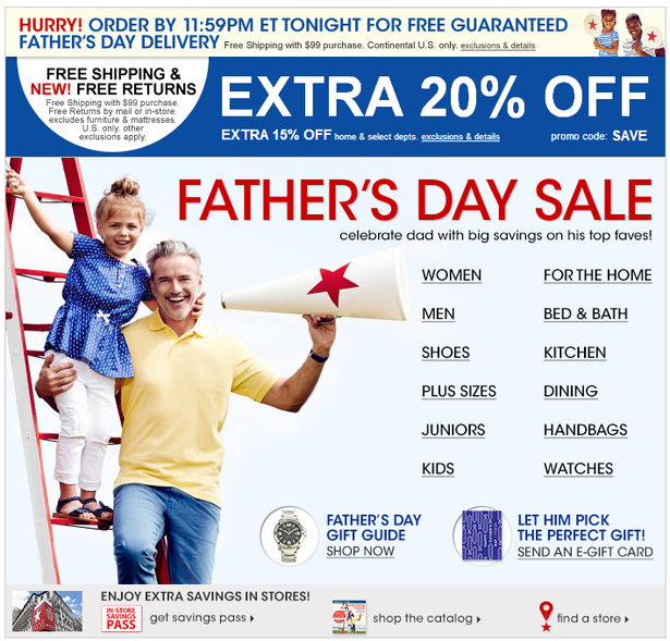
Macy’s
This example from Macy’s is bonkers. The subject line advertises Father’s Day gift ideas, but then the first link is for women’s products and there’s also a link for handbags.
It feels like there’s a bit too much going on and a few too many product managers demanding to get their share of the pie.
And this isn’t even the entire email, there are five other promos beneath this one.
Reiss
Reiss sticks faithfully to its white, text CTAs, which maintains a consistent brand image but means they can occasionally be difficult to see.
In this example I think it’s easy to overlook the CTA against the light background.

Macy’s Again
Sorry to keep harping on about Macy’s, but this email is extremely cluttered. I didn’t even notice the promo code the first couple of times I looked at it.
It’s also followed by a huge amount of other content promoting homewares, furniture, cologne and even mattresses.

Currys
Although the CTA sticks out, there’s too much text on this email and there’s not enough to inspire the recipient to actually click on anything.
Currys also falls victim to the trap of cluttering its email with far too many different offers and promotions further down.

The Whisky Exchange
I feel bad including this email as The Whisky Exchange is generally very good, however in this instance there basically aren’t any CTAs. I assume you just click on the picture…

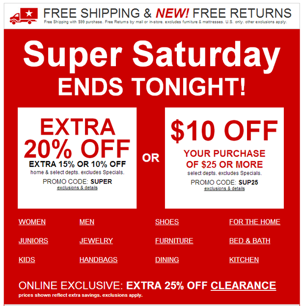
One final Macy’s email
Another busy, busy email from Macy’s, this time with a confusing selection of offers.
The box on the left offers you an extra 20%, 15% and 10% off – which is it? Or you can get $10 off. Or there’s an online exclusive deal at the bottom for 25% off clearance products.
Super Saturday sure is a confusing time down at Macy’s.
Comments