
All of whose contributions to the following have been invaluable. (You can therefore read the above as, “if you pick on me I’ll get my older brothers on you.”)
Some of these predictions will be more obvious than others, but I’ve decided to err on the side of ‘likely’ rather than ‘wildly fanciful’.
Some of these predictions will also be more about what I’d like to see, rather than what we’ll definitely see.
Anyway, with that massive list of caveats out of the way, let’s begin.
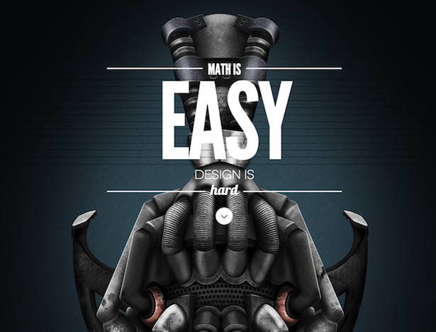
Parallax scrolling for everybody
Now that mesmerising parallax scrolling templates are readily available on WordPress and other platforms for very little expense, expect to see a lot more highly innovative, narratively driven web pages.

Card design
As Chris Lake states in his round-up of card-based web design, cards are ideal for the TL;DR generation, perfect for mobile devices and responsive design.
We’ll certainly be seeing a lot more of them in the years ahead.
Coca-Cola

Material design
The meeting point between skeuomorphism and entirely flat design. Google invented it apparently, here’s a quote directly from its manifesto:
The material is grounded in tactile reality, inspired by the study of paper and ink, yet technologically advanced and open to imagination and magic.

More examples from the blog can be found here: What is Material Design?
Ghost buttons
Much like an eerie spectre hovering in the corner, ghost buttons aren’t meant to distract you, just attract your attention in a subtle way.
They are transparent but have a recognisable shape, are bordered with a very thin line and contain light sans-serif fonts.
They’re not quite a call-to-action. Perfect for designers not wishing to clutter their sites with albeit necessary navigation.


See more examples in 12 supernatural examples of ghost buttons in ecommerce.
Speed
“It’s always talked about, but people don’t always do anything about it,” according to Dan Barker. He continues:
These things come and go in waves. There was a period where everyone would try for minimal graphics to speed things up, then desktop connections got faster and nobody worried.
Then mobile came along and everyone worried again. Then 3G got faster and lots of sites let it slip. Now with things like the Black Friday queuing debacle, I think people will probably start to look at this again more broadly.
Micro UX
Micro UX design is all about delighting the user by using simple innovative design that not only makes a task easier but also creates an engaging, humane experience that’s a pleasure to repeat.
Hopefully the trend for larger experiences built on these little touches will really shine in 2015.
The Threadless shopping cart pop-out that bounces up and down with happiness

The simple way to switch between Twitter accounts in the iPhone apps with just a drag of the finger

More joyful examples can be found here.
Hidden menus
It’s becoming more popular for websites to hide navigation off screen until you interact with an element towards the top left or right of the screen.
Gmail Inbox

Here are 10 more sneaky examples of hidden website menus.
Pinned elements
Over to Dan Barker for this one:
Pinned elements have caught on over the last couple of years but never gone entirely mainstream. Whenever I do user tests on tablets and the header is *not* pinned on long pages, users complain about it.
I therefore half-hope, and expect that this will spread a little more.


Scrolling not clicking
Scrolling through webpages is far quicker than clicking. It helps convey masses of information without slowing down the experience for the user, it’s mobile and touch friendly, it’s a non-committal action that requires little thought and it’s perfect for webpages where the purpose is storytelling.
World’s Highest Website

Nike Air Jordan

Upwardly responsive
Although there are plenty of brands adapting their websites for smartphone and tablet users, responsive design should work for bigger screens too.
Quoting Chris Lake from his article on websites designed for big screens earlier in the year…
It goes without saying that a growing proportion of your website’s visitors will be using handheld devices with little screens, but you may be surprised by how many people use bigger screens.
Ecommerce brands will hopefully recognise this going into 2015 and adapt the experience for our giant screens in the office and at home.
Firebox

Pull & Bear

Motion design
Chris Lake rounded-up 14 motion design trends for web and mobile interfaces back in July and many of these we will hopefully see more of next year…
Infinite scroll fade ins
More content! More!

Dynamic/animated charts
Why bother with static images when you can render a chart on the fly?

Modular scrolling
It is possible to scroll individual columns, as well as whole pages. If you scroll down this very blog post, you can see it in action too.

BIG FONTS
Dan Barker really hopes that big fonts will make a comeback.
You see them on some blogs and publisher sites, and they work really well on mobile, but they have yet to resurge on ecommerce sites.
Perhaps 2015 will be the time.


Shades of colour
By choosing one vibrant colour, and various shades thereof, then offsetting it against a neutral background you can create a rather elegant looking interface.
Select Device

Qatar Airways

There are more examples in Chris Lake’s beautiful designs based around shades of colour.
Super-navigation
You may see more thin permanent menus across the very top of larger websites. These bring unity, allow consistent navigation across multiple pages and are a handy place to present alerts.
Check out more examples here: 10 compact examples of super-navigation
Mobile first, but not only
‘Mobile first’ well and truly took hold in 2014. Unfortunately sometimes that means that things look great on mobile and dreadful on desktop and tablet.
As Dan Barker states:
I’m not sure that will end fully, but if you are reading this sentence and you have anything to do with a design project, please do remember that ‘mobile first’ shouldn’t mean ‘mobile only.
We’re still in that period where people carry out their most important tasks on desktops and tablets (booking holidays, buying from a site for the very first time, online banking) so it’s vital that the desktop audience is still catered for.
Credits
Again a huge thanks to Dan Barker, who can be find over at barker.co.uk and Chris Lake, who you can hound on Twitter.
Finally a massive thanks to the awesome gang here at Team Editorial, Mothy, Ben, Matt and Graham.
Comments