
For trichromatic design it is often the case that there is a ‘main’ colour, an ‘active’ colour, and a ‘highlight’ colour. A limited palette goes further when you reverse out the colours in certain areas (menus, or buttons, for example).
I wanted to highlight some examples of mobile interfaces that primarily focus on two or three colours, along with plenty of white (or otherwise neutral) space, and a lack of unnecessary clutter. In other words: minimal design. Less is more.
Mobile Marketing Best Practice Guide So let’s take a look at a few examples. I don’t claim to have used all of these apps and sites, and one or two are concepts, so the focus here is on the look and feel, rather than the user experience. Click on the images to see more in-depth or full size screenshots.
Paratt
This is a very clean, very content-focused mobile interface, which allows product imagery and logos to inject more colour into the overall look and feel.

Help Make It
This donation-focused app uses a blend of black, white and peppermint, alongside distinctive typography.

Anhanguera
Anhanguera’s brand colours are reflected throughout its mobile site. It regularly inverts these three core colours, to mix things up for the user.

Fashion Adviser
This Fashion Adviser app designer also knows that various shades of grey work a treat alongside hot pink.

Guide
This app uses its third colour as a kind of navigational anchor for the eye.

SnelTrein
One of the nicer travel apps that I’ve seen.

PrivatBank
Icons are proving increasingly popular. Ultra-obvious icons don’t require any labels, and are better still.

Bitcoin app
An interface design for a Bitcoin app, by Karol Ortyl. Clean, strident typography, and a good example of reversing out colours.
![]()
Pawwholla
Very clean and very flat, though the colours aren’t to my taste.

The Corner
How’s this for minimal? The monochrome, type-driven approach may be too stark for some, but I like it. It looks fit for purpose…

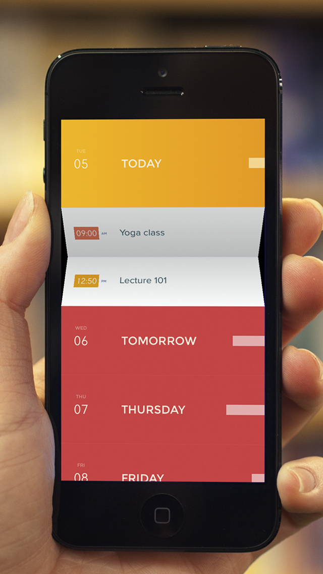
Peek Calendar
“The calendar, humanized” is the strapline. This certainly appears to be a rather elegant way of expanding content on a mobile device, and isn’t something I’ve seen before.
DNB
This mobile app design from DNB uses three main colours to establish a compelling visual experience for users. This makes good use of limited screen estate, with clear navigation prompting the user into action.

Swing
Swing is a concept for a music app that has embraced flat design. No visual clutter. Lots of black, white and red, with images once again used to add colour.

Target
Target’s in-store mobile app relies on three main colours, and is very big on iconography, a trend in modern web design.

Fantasy League App
Really crisp typography, plenty of space, and another example of trichromatic design. Top work by Brian Waddington.

Airwala
Bajinder Singh has created a beautiful design for this travel app. Typography is design.
Outfit Of The Day
This fashion app is big on iconography and a subtle colour palette, allowing the high quality imagery to stand out.

MenuSpring
Here’s another design from London-based Ben Dunn, this time for a good-looking app aimed at restaurants.

Coffee App
Man, I’ve been waiting for something like this for years. Skinny, lightly-coloured fonts against a dark background can provide poor contrast, but the full size screenshots look better.

Unvit
An easy-on-the-eye app for connecting up multiple social networks. Icons, plenty of space, and shades rather than mutliple colours.

I hope these examples hit the spot if you’re working on ideas, interfaces, colour schemes or typography. Check out these other examples of mobile design inspiration, if you’d like some more UI candy.
If you have thoughts and observations about this kind of mobile design then do leave a comment below.
Our Festival of Marketing event in November is a two day celebration of the modern marketing industry, featuring speakers from brands including LEGO, Tesco, Barclays, FT.com and more.
Comments