
This content can have wildly different aims – to convert, to inspire, to inform, to guide – and often has to be authoritative.
Cramming all this content into a website is difficult. What should charities prioritise? How should users navigate?
Alex Wright, CEO of Friday, a web/service design agency that has worked with several charities, does a better job of summing up just how big this challenge can be.
“The largest charities are sprawling,” Wright says, “they’re retail networks, and complex fundraising organisations, and political lobbying organisations and volunteer communities, and collections of services which can be hugely diverse (the British Red Cross will lend you a wheelchair, help with your asylum claim, trace your lost relatives overseas, help you in a flood, and teach you first aid…). They’ll do content design about each of these things individually, but structuring and prioritising content between them is a big challenge.”
I must admit, having a look around various charity websites myself, I was left a little overwhelmed by what I found. Just looking at homepages, many do a good job of choice reduction / prioritisation, whilst also allowing for discovery, but others feel jumbled or at least lacking a plan.
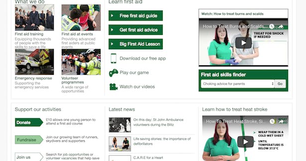
Here’s St John’s Ambulance below the fold – not particularly inviting:
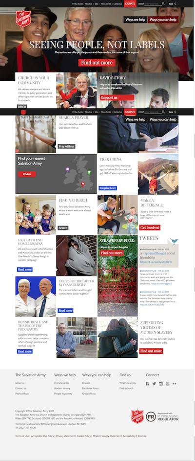
Elsewhere, The Salvation Army is perhaps guilty of overdoing its homepage content blocks:
This is partly personal taste in web design of course – I haven’t user tested the two sites above (aside from doing a bit of pogo sticking around), but I wanted to discuss the issue of content design with experts such as Friday’s Alex Wright, to understand the current state of web design in the third sector.
Content prioritisation
The stuff of web project management is all about meeting user needs and prioritising content to do just that. So I asked Wright whether prioritisation is an issue for charities – his response was pretty forthright and equally revealing.
“In short, yes,” prioritisation is an issue, says Wright. He continues, “Just over a year ago Friday held a roundtable for senior digital leaders within the not-for-profit sector. The session was attended by 10 different organisations spanning children’s charities, those involved in emergency relief as well as care for the elderly, sick and disadvantaged.
“Our conversations revealed that they all had reasonably mature digital fundraising operations – with the staff and agency support to deliver it. The most mature were able to make prioritisation decisions within fundraising, about the value of certain audiences and actions (a one-off cash donor versus a fundraising fun-runner, etc.) and prioritise digital content and spend accordingly.
“But most of the charities were now beginning to digitise core services, the things they did to help people. As well as being much more challenging (genuine digital transformation, rather than just channel-shift), digital services for beneficiaries give rise to prioritisation conflicts. What’s more important – a donor prospect who’ll offer you £20/month, or a beneficiary who the charity exists to help? And what does that mean for budgets, resources, content, navigation, etc.
“There’s a structural problem that compounds this. These audiences are often served by different directorates. Arbitrating between them is almost impossible. They can all point to clear user needs for their audiences.
“There’s a cultural problem too. Charities are full of people driven by the cause – and tend to regard all contributions to the cause as good. They’re not good at telling each other that one contribution to the cause is less important than another. This feels like refusing help.
“The result is digital clutter. And most charity insight departments will tell you that their most engaged audiences span multiple audience types – they consume the charity’s services and fundraise for it, and volunteer in the shop, and campaign on its behalf etc.. This makes the prioritisation even harder.
A few themes picked up by Wright there, then:
- Possibility of ‘too many cooks’.
- Fundraising strategy has channel-shifted, but digital transformation of services a different matter.
- Difficulty in attributing value to some interactions (e.g. helping beneficiaries).
- Multiple overlapping personas.
These are complex issues for both comms strategy and information architecture to get to grips with. In some ways it reminds me of the service design work Government Digital Services has been doing over the past few years – making information easy to find and understand, and services simple to use, with charities having the additional difficulty of having to make everything compelling / inspiring / meaningful (in a way that tax returns or driving licences are not). More on that later.
Cost is the elephant in the room
Before I start to sound overly critical, it should obviously be said that charities have big constraints when it comes to web development.

Rob Langley-Swain, Strategic Director at design consultancy Supercool, expands on this, as well as hinting again at cultural issues within organisations:
“I don’t think it is fair to say that charity website projects are compromised by a lack of prioritisation, a lot of the time there are a number of factors which have to be considered. Most commonly budget and time constraints are the biggest factors influencing or constraining a project’s creativity. I would also say, in our experience, that rather than a lack of prioritisation causing an issue, it is a battle to make sure that every voice of an organisation has a fair share of the limelight on a site.
“This could lead to a website becoming vast, messy and difficult to navigate through as, once our sites are live, almost all content is editable by in-house teams who can add, move and amend content as they see fit; but we account for this when designing a website.”
Langley-Swain’s final point about in-house design is a very interesting one. As much as they benefit marketers, new and improved CMS platforms such as WordPress and Joomla can cause problems, too. They allow content management without IT involvement, but may lead to a tempation to create content quickly (in a template) without properly thinking about its format.
Pete Czech of digital agency New Possibilities Group writes “because templates are so inflexible, your content stops being content. It starts becoming as assemblage of items that create a page.”
Every page is a homepage
One of the trends that charities must keep up with is that of multiple entrance points to a website. The explosion of social content and the continued importance of search means that people may land deep within your website looking for a particular bit of information. These users must be oriented, so they know where they are in the website and where they can go from here.
This is a fundamental job of information architecture. Supercool’s Langley-Swain says “We tend to work with the idea that every page on a site is a homepage of sorts – it needs to fulfil the job of a homepage in terms of navigation, signposting and cross posting of interesting and relevant content that will help visitors find useful information, keep them on the site longer and provide a deeper engagement with the organisation”
As Supercool’s creative director Katie Parry puts it, this is “providing helpful stuff to all manner of people, as you can rarely be sure exactly why someone’s come to the website.”
You can see this done very simply and effectively by Cancer Research UK on the brain tumour research page below. There’s:
- the appropriate category highlighted in the header menu
- a breadcrumb trail showing where on the site you are
- a call to action to donate
- a content block for patient stories
- a news section for any article tagged ‘brain tumour’
- links to information about brain tumours
- a link to CRUK’s strategy
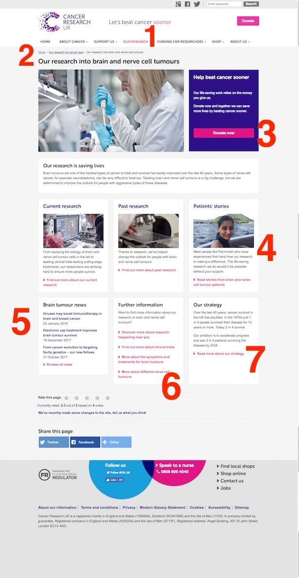
This is good information architecture. There are no bells and whistles, everything fits on to a modest sized page, and there are plenty of onward journey options.
Who is designing good content?
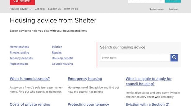
My personal favourite is Shelter, for its GDS inspired approach.
There’s plenty of plain language addressing user needs. Nothing unnecessary is included. Scrolling is kept to a minimum on the homepage. There are breadcrumbs and a stripped back menu. There’s no content-blockitis – just properly accessible text and links.
Here are some examples…
1) A homepage with a simple message, one call to action (donate now) and a pared down header menu:
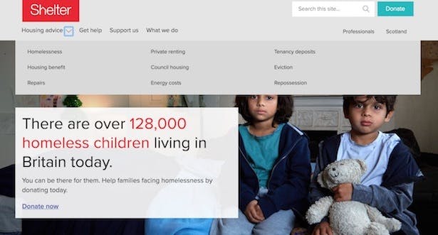
2. If images get in the way of good informaton architecture, get rid of them. Here, a search box, category links and popular pages give the user numerous ways to find what they’re looking for.
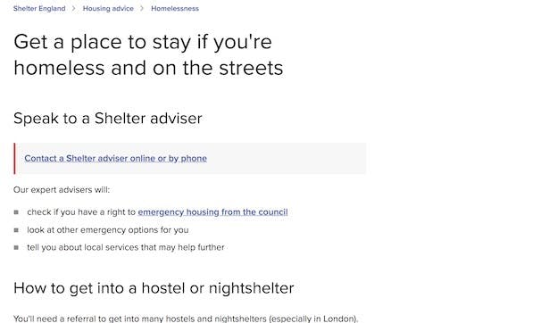
3) Note the simplicity of this ‘get a place to stay’ page. It provides only the information needed, in plain language. Important links are highlighted in a grey box with red left border, and breadcrumbs help orient the user.
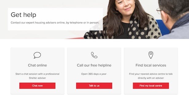
4) Yet again, the ‘help’ page performs a function with minimum fuss.
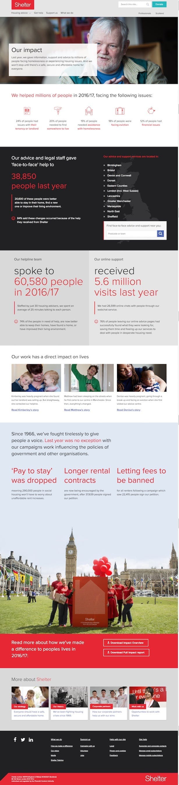
One could argue it doesn’t inspire as much as it could, but there are areas of the site (addressing fundraisers not beneficiaries, for example) where it steps out of its truly functional garb and tells a story. That might be with the simple use of more photography and the odd content block. Or, as shown below, it could be something more ambitious including data visualisation, full-width photography, widgets (‘find face-to-face advice’), document downloads and links out to blog posts detailing some beneficiary stories.
Of course, there are plenty more great charity websites out there, and they don’t have to be quite as regimented as Shelter’s to achieve good information architecture. But this is just one approach I particularly admire.
Supercool’s Katie Parry strikes a note of warning when she tells me that though my personal preference might be for “fewer messages per page and an overall simplicity,” some of her anecdotal research talking to clients suggests that a lot of people prefer being shown a lot of stuff all in one go, “rather than feeling like they’re being forced down a specific path by an organisation/web designer.”
This brings us on to our fairly obvious conclusion.
In conclusion – time to develop a passion for user research
I’ve skirted around a few issues here – design, architecture, organisational culture, project management, IT.
I don’t want to paint a picture of the charity sector as particularly lagging in this area, but I do feel that nailing content design and information architecture will really help charity websites to stand out and increase engagement, whatever it is they are measuring.
And though I’ve given my own opinions here, I haven’t tested anything. Testing is crucial for charities because, as Friday’s Alex Wright puts it, “the most engaged audiences span multiple audience types, [so] there’s a need to digitally support greater engagement through a broad mix of different types of content and journey.”
More plainly, Wright says “engagement with charities can be multi-faceted” and therefore “the bridges between types of journey really matter”.
User research and testing is the only way to understand if this multi-faceted approach is being achieved. So, if you’re in charge of a website tender for a charity, make sure you go out there and employ an agency with good usability chops that talks about content design and information architecture, and doesn’t try to blind you with fancy mockups at the pitch stage.
Do you work for a charity? We’d love to get your thoughts below.
More on charities:
I help design websites for churches and faith-based organizations and this article describes their struggle as well. There are often too many cooks in the kitchen and they mostly use CMS platforms like WordPress, SquareSpace, and even Weebly. This piece really helps put language to the issue. I love the section on every page being a homepage. That has really been a blind spot for me in failing to think of the way social media can link deep into the site.
Cheers, Will.
St John Ambulance are currently working on new website to be launched in a couple of months.
A very considerately told story. So interesting to see the perspective from outside of the charity digital world.
The main challenge is what Alex Wright says: good digital operation for a charity crosses a number of very different strategic and technology skills – our digital leads and digital teams need an understanding and skills in retail, marketing, brand, political campaigning, service delivery, publishing. Plus they need to understand the policy nuances that differentiate their charity from others working on the same issue. So it’s a tough job but also wonderful because of the variety and the opportunity to learn new things.
One way that can help with prioritising audiences on the website is to first focus on audience journeys and plan the content on a website based on where the person(a) is likely to come from and where they are likely to want to go next (and you can glean of this form stats and market research). In that way you’re planning the website alongside other digital outputs (e.g. marketing, email, social media). The website becomes a step in the journey not the beginning and the end of it.
Great post Ben, with some excellent points that seem to capture some of the challenges for charities.
In addition to Shelter, a charity close to my heart and one that seems to have adopted some of the principles that you mention above is The Anthony Nolan Trust -https://www.anthonynolan.org/. Don’t know if you have seen their site?
The CTAs are incredibly clear and IMO they have combined some nice (less is more UX) with the drop downs on the home page with adherence to accessibility standards making it very easy for all to either donate/or register.
Would be gd to hear your thoughts on the work and could form part of a nice follow up piece on UX case studies in the non-for-profit sector perhaps?
Hi Martin.
Many thanks for the special mention! We are aware though that we have some way to go on our IA, and are planning user research next year to further understand our users’ needs and motivations, as well as a few initiatives to embed more of a user-centred culture.
We have a pretty unique challenge in terms of our audience groups, and I’d be very happy to go into more detail on that as a case study. Feel free to contact me if you’d like to take that forward!
And thanks for a great read, Ben!
Kind regards
James
Really interesting piece, Ben. Another issue I have found working with NFPs is that they are understandably reluctant to used language which in any way appears to judge their users, such as ‘drug addiction’ or ‘alcohol abuse’. With one organisation I worked with, this meant neither of these terms appeared on their home page even though they were two of the central issues the charity’s users needed support with. Our keyword research showed that these terms appeared in search queries more than 10 times as much as their softer alternatives, leaving the charity with the difficult decision over whether to use these terms on their main pages or risk not being found be people who really needed them.
@Chris Really interesting point.