First, what’s a PWA?
Progressive web app is a term coined at Google. You can read an explainer post here, but essentially PWAs are websites that feel like native apps.
PWAs “use an app shell, which is the minimal HTML, CSS, and JavaScript required to power the user interface. The first time you load the site, the app shell is cached on your phone. On subsequent visits, this app shell is loaded very quickly from the local device cache, reducing the volume of data that needs to be freshly downloaded.”
Google describes PWAs as reliable, fast and engaging (note that Chrome will prompt PWA browsers to add the app to their desktop if they would like to).
Hobbycraft’s new PWA is a great example of the advantages of the technology. The website is quick, the products are displayed well and avid crafters will no doubt return to the website confident it will serve their needs.
Here are eight things I loved.
1. Speed
The video below is produced by Mobify (the platform behind the Hobbycraft PWA). It speaks for itself and demonstrates the main benefit of a PWA.
2. Picture slider menus
When you choose a category and land on a product listings page, the Hobbycraft site uses slider menus to allow you to filter your results.
There are more conventional filter and sort options further down the listings page, but with Hobbycraft stocking plenty of products, these slider menus help the customer get straight to what they want, without having to drill deep into the burger menu.
Simply hit the painting category on the homepage, use the slider to select oil paints, and you’re right where you want to be without having to think.
I’ve mentioned these sliders before, they’re used by AO.com. Hobbycraft artfully ensures that on loading, the right-most category thumbnail in the slider is only partially visible, which is the signal to the user that this feature is swipeable.
![]()
3. Cute category icons
Speaking of the homepage, here are those nice category icons. The homepage does have a banner at the top, used to promote offers and popular products, but below the banner are these easy-to-use buttons that will function as the primary navigation tool for many users.
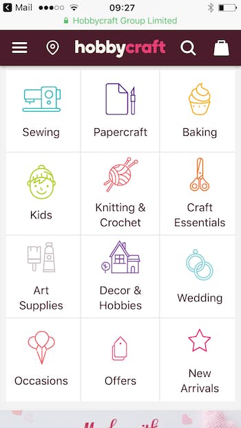
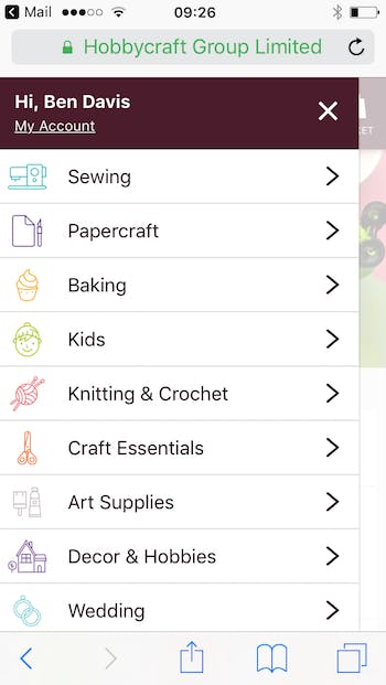
The icons are mirrored in the slide-out burger menu, increasing the salience of the categories and making navigation easier.
4. Featureful store finder
Store finders aren’t the sexiest part of ecommerce design, but users notice when they don”t work. A clunky store finder with slow-loading maps and poor information can be very frustrating.
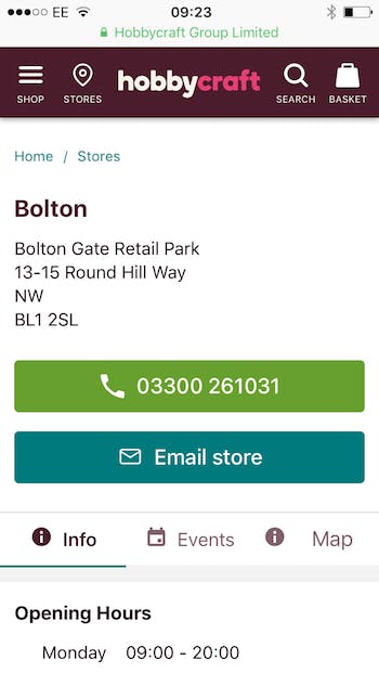
Hobbycraft has a really good one. I can search by postcode or town, or allow the site to use my location. As you can see from the screenshot below, I can then click to call or click to email the store.
And that’s not all…
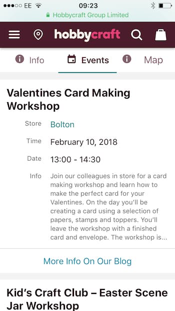
Each store has an events tab, with event listings and descriptions, as well as links to the Hobbycraft blog, where more information is available. This is a really nice touch.
5. Easy-to-use filters
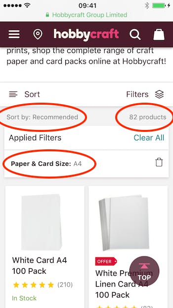
More standard ecommerce features done very nicely indeed. I like the little filters icon, and the clear information which tells me which sorts and filters I have applied, as well as a bin icon to delete filters or a ‘clear all’ option.
6. Delivery prompt in basket
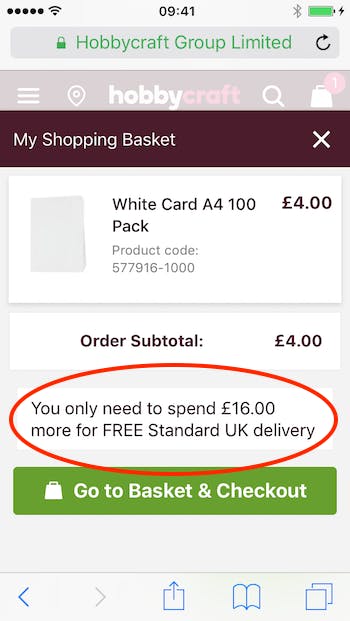
More best practice. I add a product to bag and get a prompt to spend a bit more money in order to qualify for free shipping. This can boost average order value and leave the customer feeling satisfied they haven’t been hit with extra charges.
Returns are free, too.
7. Best practice site search
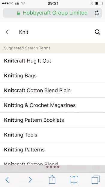
Site search gives me suggested terms, which helps when I can’t quite remember the name of the product I was looking at previously or that had been recommended to me.
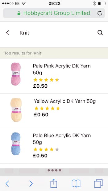
Scrolling down beneath the suggested search terms, the user can also select from ‘top results’ which include a product thumbnail, average review rating and a clear price. All exactly as the user would have it.
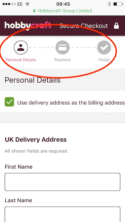
8. Simple checkout
Lastly I’d like to pick out a clear path through checkout, with three sections highlighted as I progress.
Conclusion
As you can see from the features I have picked out, the site doesn’t rewrite the rulebook of UX, but it does stick steadfastly to some time-honoured best practices.
Combine this solid design with the benefits of the progressive web app (speed, reliability and engagement) and you’re left with a very good website. One which should delight crafters with its ease of use.
Further reading for subscribers:

Comments