
1. Fewer interfaces. More convergence.
UXdesign.cc brings us a brief and admirably clear description of these two trends. I’ll summarise.
Firstly, the convergence of web design is emerging through comprehensive libraries of interaction design patterns. With these well established, why would you deviate during your web build?
Unless your service design requires an interaction hitherto untackled, there is likely already a convention.
Making things familiar for the user can often entail following the crowd, in a discipline where many argue intuition is a fallacy.
Not only are interfaces converging, they may also slowly reduce in significance.
That’s due to the trend towards push messaging and the unbundling of content into the mobile OS or, eventually, Facebook Messenger.
If artificial intelligence improves (we’ve already seen high profile experiments such as Google Now), arguably content and services will be recommended, thus reducing the scale of the customer journey and concentrating it within familiar interfaces.

2. Hawks and doves
Though we have already touched on the convergence in web design, there’s a flip side to that coin. Needing to stand out.
Matthew Mombrea argues there will be an emphasis on originality in 2016.
Certainly that’s something we might expect agencies to do for bigger clients – but whether it’s done sensitively (through imagery or rich media), or results in hard-to-use white elephants, is another matter.
Animation and video backgrounds have been used partly because of this desire to stand out, and are divisive design elements to some extent.
Many tip illustration and animation to be a continuing trend in 2016.
Alfred is an example of a website using animation (combined with parallax scrolling) in an attempt to stand out. Click to try.

3. More creative hover states
An enjoyable detail now. Simplifying design necessitates ‘accents’. Flourishes such as creative hover states help the user determine which parts of a minimal layout are clickable.
These interactions are also enjoyable, though they are, of course, chiefly intended for desktop.
Tip of the hat goes to Brian Hoff Design, whose website includes the following interactions.
‘Knightrider’ hover state

Dynamic hover state on ghost button

Burger button expands on approach and reveals slide-out call to action on hover

4. Centred content
I saw this mentioned on Wix and it seemed obvious but something we rarely comment on.
It’s partly a result of mobile-first design and the convergence of templates (such as WordPress).
Those sites that have decided to use a minimal homepage design, perhaps with a fair amount of page below the fold, have often prioritised a main message, top and centre.
This main message is often surrounded by a visual, a GIF, perhaps a strong colour or texture.
Such an emphasis on one clear message previously used to characterise websites with little content, but others are starting to adopt this boldness, knowing that distinctive branding can grab attention and encourage dwell time.
Lush, a brand I’ve written about previously, uses this approach in ecommerce, changing a main image and message every month, rather than using a dated carousel.

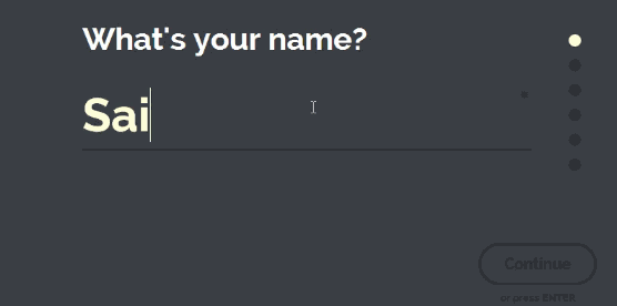
5. Full-screen forms
Another result of mobile-centric design is the full-screen form, whether search field or checkout.
The aim is to focus the user on the task at hand and increase ease of use, and subsequently conversion.
Here’s an example via Saijo George on Medium. And one below, not quite as expansive, from The National Trust’s new responsive website.

6. Authentic, brilliant photography
Look at the dude below. He’s a happy chap, but not a very sincere one. By that I mean, he is a stock photography legend.
I’ve seen this guy on my holidays in Spain (in the window of Caixa bank), he’s adorned an old Econsultancy training brochure (we’ve moved on since then) and I’ve seen him on TV, cracking the same smile.
Photography now is about capturing the actual service or product you provide, in the wild.
Not only should the photo be creatively inspired, but it needs to load efficiently and be at a high enough resolution.
Lush, to go back to one of my favourite examples, uses Cloudinary to upload assets to the cloud and have them delivered by the Akamai content delivery network (CDN), which reduces latency by using a local server that has cached versions of static assets.
Not every site needs a CDN, and there are other ways to increase speed, but it does allow for high performance with great imagery.
Below, you can see the crispness Lush achieves on white space. Check out the website to see the full impact, including GIFs showing the products ‘in the wild’.


7. Less scrolling
I’m going to quote Matthew Mombrea here on the evils of scrolling.
If sites were to consider their content and the goals of the interaction a little more, clicking to trigger a drill down into the site wouldn’t be such a bad thing.
Combined with micro experiences and modern front end programming, a mouse click or screen tap doesn’t have to mean a jarring page refresh any longer.
How people got to a point where you have to scroll or swipe 50 times to view the primary site content is beyond me, but I think sense will prevail in the next iteration.
I have to say, I agree with Matthew. One of the other downsides of pushing content further down the page, and reducing the number of pages, is that you send users to search when perhaps your search functionality is not good enough (or the user may not be accustomed to this behaviour/journey).
The National Trust site, mentioned above, suffers from this in part, with users finding navigation difficult (see the comments here) whilst the organisation carries out post-roll-out improvements.
8. More scrolling
Yep, that’s right, scrolling really is the most controversial web design trend of the moment.
And as much as I think some have taken it too far, there are others that see long-arsed pages as functional and persuasive.
Jowita Ziobro on Medium points out that it’s easier to scroll than to click, and smartphones on slow or limited data networks encourage scrolling (over page refreshing).
Scrolling allows websites to spread out, favouring minimal designs with beautiful imagery spread throughout.
Jowita cites Time magazine as a publisher that has gone for the infinite scroll, allowing users to discover more and more articles.
She puts her money on “fewer links, more buttons, bigger ‘clickable’ areas, and taller pages that expect to be scrolled.”

9. Almost flat
It would be silly to point to flat design as a trend to watch out for, it’s been here a while, often featuring bright and contrasting colours.
However, flat design is not just for the partisan.
As Specky Boy points out, Flat 2.0 uses flourishes such as shadows, and points to duffy.com (an agency site, shown below) as an example of this trend.

10. Modern sans serif headings; larger body text
Sans serif typography is increasingly on trend, befitting larger text on more minimal designs (see TfL’s journey planner below, albeit from an organisation synonymous with sans serif fonts).
Elsewhere, body text is thankfully growing in size as businesses lose old architecture and move from size 10 font to something more similar to Medium’s trailblazing clarity.
GOV.uk is a prime example of service design prioritising larger font (see below).


11. Bold iconography
Also motivated by minimal design, iconography is growing bigger, more detailed and generally has the pizzazz needed to enliven white space.
Much like hover state, icons are becoming a creative playground for designers who may be constrained by increasingly conventional layouts and interaction design.
Thanks to UX Pin and its design report for this one.

12. Fewer scripts?
Pages are getting heavier. And for all marketers and designers are reducing the load time of images and minifying code, it’s third-party scripts that are poleaxing some sites.
Frédéric Filloux puts it in beautiful black and white in this article on Monday Note.
When I click on a New York Times article page, it takes about 4 minutes to download 2 megabytes of data through… 192 requests, some to Times’ hosts, most to a flurry of others servers hosting scores of scripts.
Granted: the most useful part — 1,700 words / 10,300 characters article + pictures — will load in less that five seconds.
But when I go to Wikipedia, a 1,900 words story will load in 983 milliseconds, requiring only 168 kilobytes of data through 28 requests.
So, which scripts can be lost? Readers will hope advertising and tracking technology can be streamlined.
13. The death of sliders
I really hope the argument about the merits of scrolling has replaced the one about sliders.
Sliders are ultimately distracting and add weight to the page, with many businesses (I’m sure) asking for a slider then having to work out what to fill it with.
When a slider makes up the entirety of the homepage above the fold, this is when they can work better, but I’m hoping that agencies will steer clear altogether in 2016.
I’ll leave the last word to shouldiuseacarousel.com

14. Bolder ad formats mean less clutter
Publishers will be offering more native advertising, both editorial and programmatic formats.
Better targeting of programmatic, using advertiser data and cross-device tracking, should allow for more impactful ads that allow publishers to reduce scale and improve UX.
This could mean less clutter on desktop and mobile.
15. Services not pages
This is perhaps a middle ground between webpages and AI delivered content – the website as service.
We’re already there, as the aformentioned UX Pin report points out, with sites such as Facebook and Netflix. These sites are divided into pages but we don’t think of them in that way. They’re services.
Delivering the right content is of course the main objective of UX with these sites. As users begin to stop thinking in terms of pages, the importance of service design will grow.
Comments